The fares journey: from workshop to working product
The delivery of a new feature can be easy to understand in retrospect, especially once it can be touched, felt and easily understood. But bringing everyone on the journey is key to reaching the promised land. From conversations and sketches to app update, read how our new fares capability evolved.
20th Mar 2024

The delivery of a new feature can be easy to understand in retrospect, especially once it can be touched, felt and easily understood. However, there are often a great many unknowns at the start of the product development process.
This first phase, known as Discovery, focuses on the work needed to uncover the state-of-the-art and market needs. Crucially, this phase comes before any solution is designed or built. The phase aims to create a shared understanding of what is possible right now and what the next step might be to achieve the initiative’s goals.
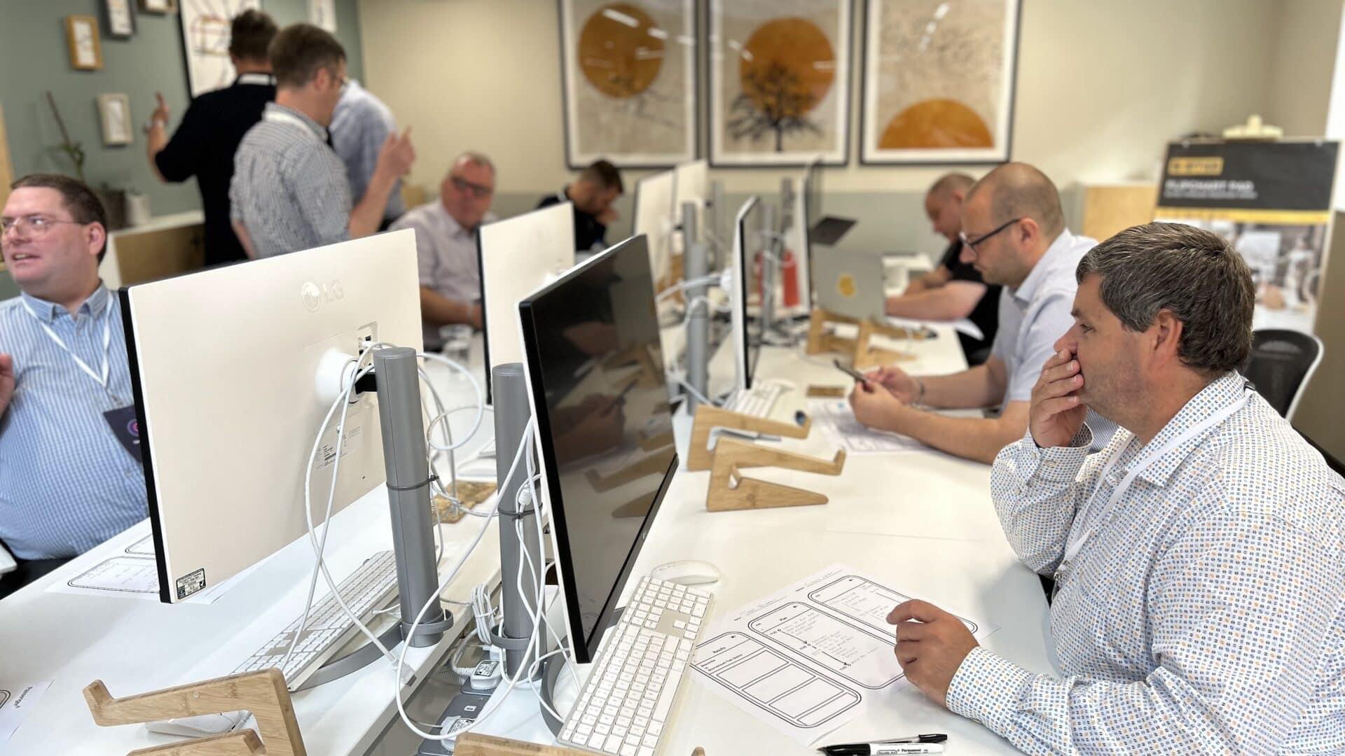
We began this phase for our new Fares capability at Passenger Live! in the Summer of 2023. The in-person event, held twice a year, enabled our team to spend valuable time learning from our customers. For them, it’s an important opportunity to contribute to the changes they want to see in the platform their customers use daily to buy tickets and travel on their services. We’ve learnt over the years that operators engage with their customers so frequently and across a wide variety of touchpoints that they understand their needs incredibly well. In doing so, they act as a consistently good representative of their customers in these kinds of discussions.
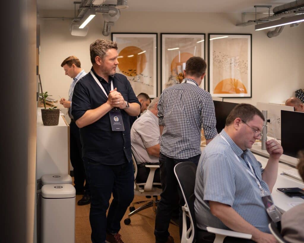
The event includes a variety of formats: feature presentations, learning opportunities, and interactive sessions that help everyone benefit from the depth of experience of attendees. The events are critical to our product development process, allowing us to share our thinking and challenge assumptions that we might have.
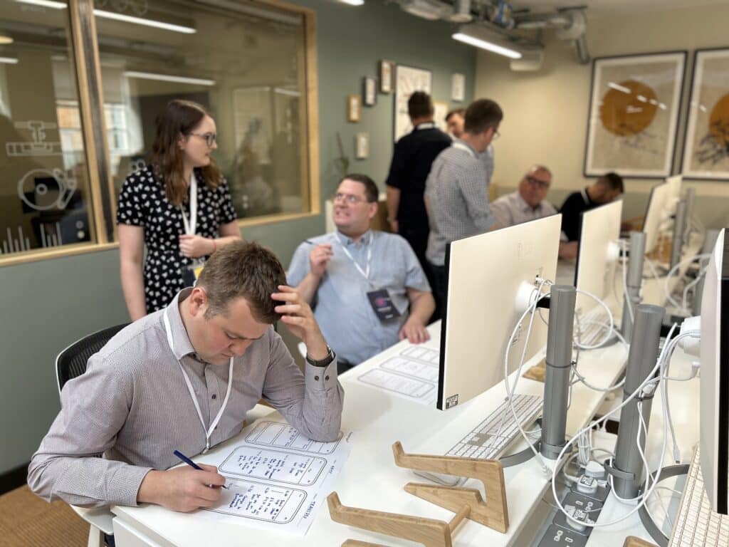
Last summer, the event enabled our Product team to begin tackling the challenge of bringing fares into the digital experience of planning a journey on mobile and online using an operator website. What would customers expect? What might be the real challenges in delivering this feature for the first time?
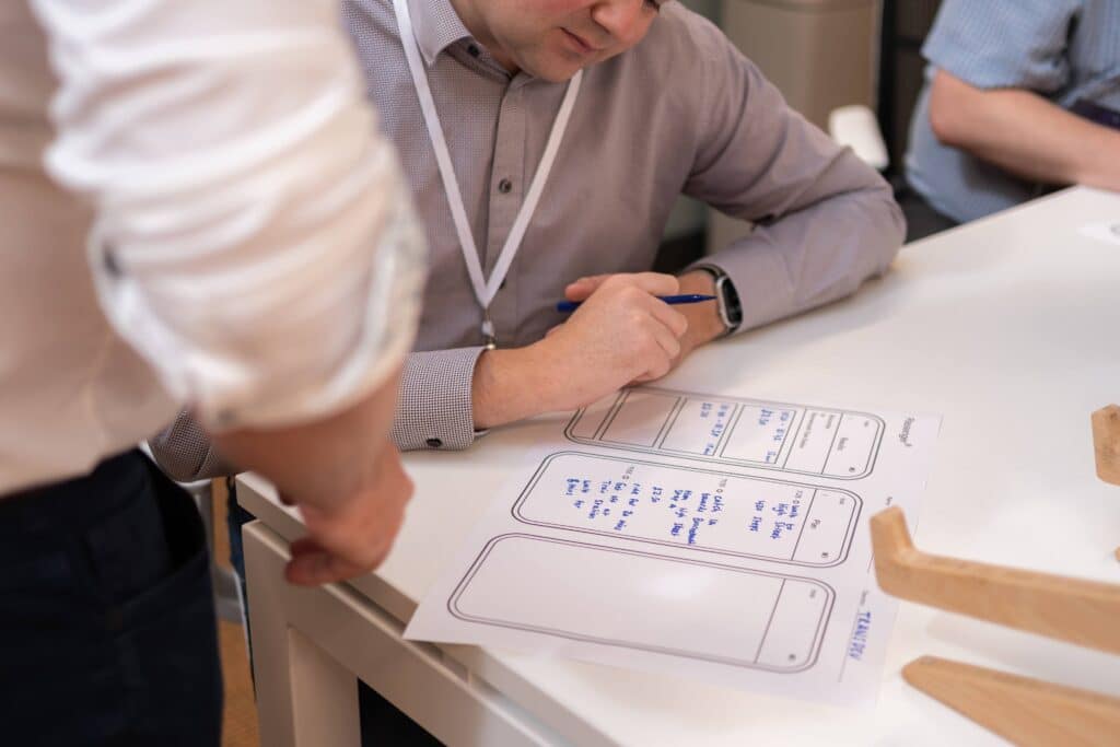
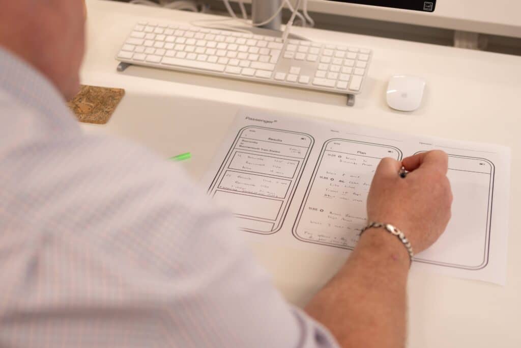
For many, these kinds of explorations are often beneficial to approach visually. So, we asked our attendees to sketch what they saw as the road ahead.
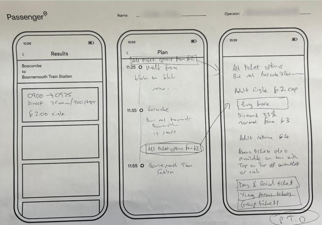
Assessing all of the ideas, we quickly learned what was important to operators:
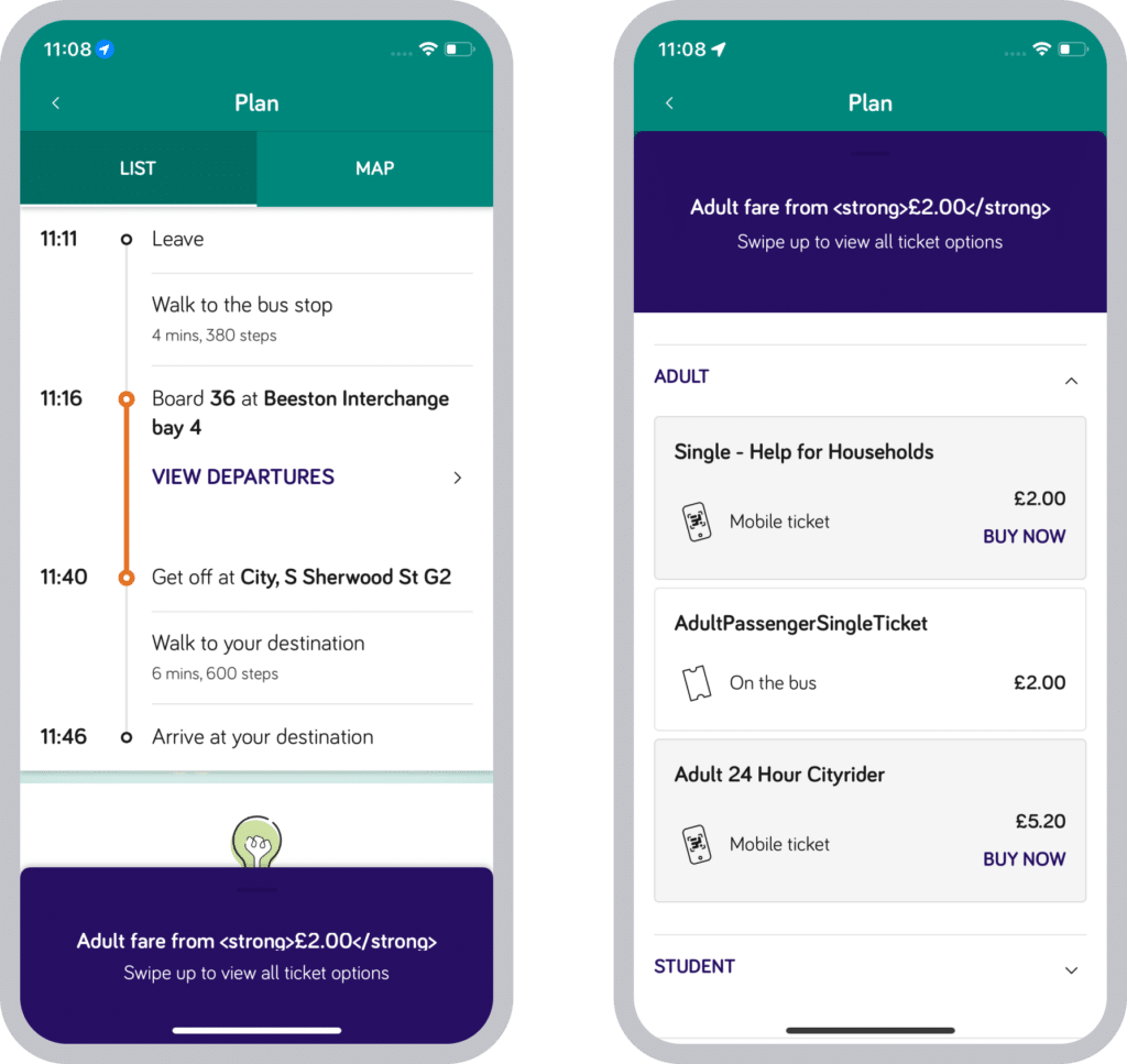
- The ‘from’ price should be shown in the initial journey planner search results, not just in the detailed itinerary (as shown above on the left)
- It was clear the ‘from’ price shouldn’t be misleading (such as by using a child fare by default), setting realistic expectations for the customer
- There was a strong desire to show multiple ticket options, such as single and day tickets
- Include a call to action for purchasing for customers to buy specific mobile tickets easily
- A clean and simple design that customers could understand easily
Crucially, the ideas generated in the workshop were captured as artefacts to be referred to later. By approaching it like this, patterns and commonalities could be easily spotted, and suggestions considered more deeply in the calm after the buzz of the workshop.
Designing in data quality
With a clear understanding of how operator teams envisaged the customer-facing aspects of the experience, much of our subsequent work focused on developing tools in Passenger Cloud to check data quality. The workshop underlined that data quality needed to be reviewed before it could be published and made available to customers. Whilst NeTEx data had been created and published to the Bus Open Data Service, there was no way yet to visualise it. Operator teams weren’t confident that what they submitted to BODS would be useful data.
So, we set about designing tools that allow operators to visualise the NeTEx data before making it available to customers. The first thing we built was a point-to-point calculator for a single service. This highlighted user experience and technical issues, including bad line names, line directions, issues with stop names, duplicate lines, and shadow fares – present because of the £2 fare cap scheme. But the calculator also had no multi-leg journey pricing, which was quickly emerging as a critical objective.
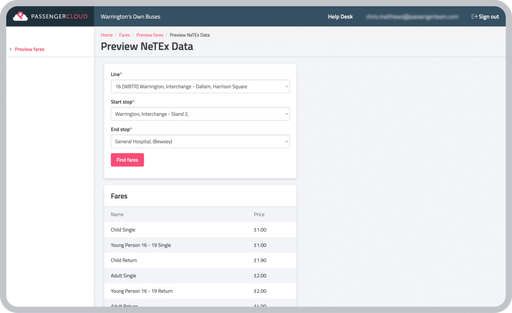
This led us to build a Fare Data Management capability into Passenger Cloud, which included a way to hide fare products from the search results. The option to rename fare products to include customer-friendly titles also became an essential part of the delivery, as this isn’t currently possible in the NeTEx data creation tools available to operators.
Reviewing fare data using the calculator tool was initially time-consuming for operators, so we simplified it with an option to export fare triangles, showing stop-to-stop fares in a familiar overview format for each route. Later, we also made it possible to configure the fare triangle export to be stop-to-stop or zone-to-zone to make it easier for some operators to compare with how they input fare data into their ETM systems.
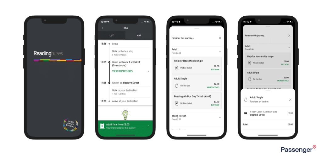
All of this culminated in the journey plan preview tool, which essentially mimicked the results that would appear in the app’s journey planner. We had test builds ready to share with both NCT and Oxford, Passenger customers leading with the data review, so they could test their fares in Passenger Cloud while being able to see what the customer would eventually be able to see on the front end.
Here are some examples of the feedback we received on our Fare Data Management tools:
- The NeTEx preview tool’s drop-down list of services lacked detail. If you were reviewing multi-operator data, you couldn’t easily see which service was from which operator, making testing harder.
- The passenger classes we set up for mobile tickets did not match those shown in NeTEx, which meant we displayed multiple drop-downs for the same passenger class.
- Some of the language we had chosen wasn’t quite right, such as ‘paper tickets’. We changed it to ‘on-bus tickets’.
- And the need to exclude services and operators from a ticket coverage when tickets would not be valid
A collaborative effort that transcended organisations
Sometimes, when you attend an event and share your ideas, it’s hard to know where they go after that and what happens to them. It can sometimes feel like they’re lost in the ether. We’re delighted with how our Discovery Fares capability turned out. Seeing it evolve from conversations to sketches to working tools and customer-facing app software has been an exciting capability enhancement to deliver. And we’re looking forward to where we take it from here!

Newsletter
We care about protecting your data. Here’s our Privacy Policy.
Related news

Start your journey with Passenger
If you want to learn more, request a demo or talk to someone who can help you take the next step forwards, just drop us a line.