Accessibility: Our Approach
Designing for everyone
Passenger delivers customer experience improvements based on research and trials to identify user needs under a continuous improvement development programme.


Passenger follows the Web Content Accessibility Guidelines (WCAG) 2.1 for the text sizes, colours and contrast ratios featured in its products.
WCAG’s four pillars are:
Perceivable
Information and user interface components must be presented to users in ways they can perceive.
Operable
User interface components and navigation must be operable: The interface cannot require interaction that a user cannot perform.
Understandable
Users must be able to understand the information as well as the operation of the user interface.
Robust
Content must be robust enough that it can be interpreted reliably by a wide variety of user agents, including assistive technologies.
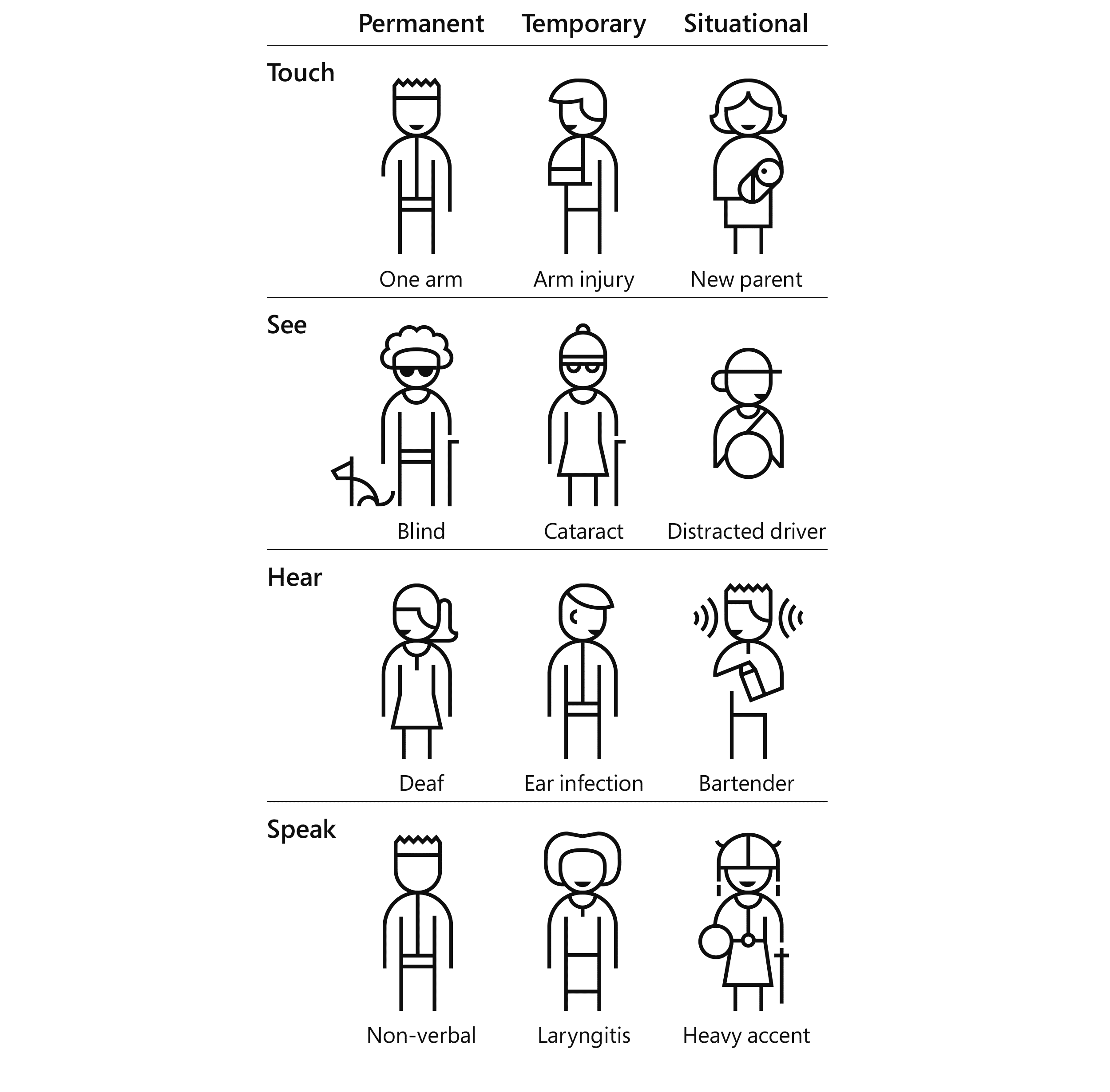
We use Microsoft’s Persona Spectrum to understand related mismatches and motivations across a spectrum of permanent, temporary, and situational scenarios. The tool helps to foster empathy, a core value at Passenger, and shows how a solution scales to a broader audience.
Passenger products have a number of features that are designed to make them easy to access on a daily basis. Here are just a few examples:
Simple account sign-up
An email address and password are intentionally the only requirements needed to sign-up for an account before a customer can make a ticket purchase. By keeping the sign-up process simple, Passenger products are easier to access and use. Customer profiling happens later in the interaction life cycle.

“Buy again”
A feature that automatically places recently purchased ticket products at the top of the ticket purchase screen. This removes the need for customers to navigate through ticket categories to find their most commonly purchased products. This significantly reduces the cognitive load for a customer to get on the move again.

Ticket expiry notifications
Customers can set notifications to remind them when a ticket is soon to expire. This helps to ensure they buy a valid ticket in plenty of time before boarding the bus. These notifications can be used in conjunction with a device’s operating system voice-over capability to ensure they are not missed.
Destination stop alerts
Customers can set alerts for specific stops (tactile, visual and audio, depending on their device settings) to notify them when that stop is approaching. This is particularly useful in vehicles which are not equipped with audio or visual “next stop” announcements, or where these announcements are not accessible.
Timetable row and column highlighting
When viewing a timetable, customers can tap a cell in the timetable and its corresponding row and column will be automatically highlighted, making it easier to scan all relevant information.
Dark mode
Dark mode can also make it easier to use the apps at the start or end of the day, by reducing screen glare in low light conditions, helping customers who are suffering from eye fatigue. For customers with longer-term sight issues, the additional contrast can also make using apps easier.

“Knowing that I’m helping everyone travel around is one of the great things about this job, and getting to do it as part of a top-tier team.”
Lead Engineer (Web)
Jon Ginn

Start your journey with Passenger
If you want to learn more, request a demo or talk to someone who can help you take the next step forwards, just drop us a line.