Resource Guide
5 steps to improve accessibility for bus operator websites
Understand best practices for information published on bus operator websites and earn the first level of ITLS accreditation


The Inclusive Transport Leaders Scheme (ITLS), launched by the Department for Transport in July 2020, has been designed to improve awareness and implementation of inclusivity of the transport system. It aims to make it easier for more passengers to travel independently on public transport.

20% – thats 1 in 5 people in the UK – are registered disabled. This makes it harder than it should be to access education, employment, social and leisure activities for those people.
Understanding best practices around information published on the web helps operators to identify where they can easily make changes to earn the first level of accreditation – ‘Inclusive Transport Committed’ – and show that the foundations have been laid for accessible services over the long term.
Improving accessibility on your website needn’t be time-consuming. Below are 5 ideas that will help to get you on your way to becoming an Inclusive Transport Leader.
Let’s take a look at what steps you can take to do that:
1. Publish a web content accessibility statement
One of the first things you can do is to publish a statement describing where you are on the journey and how you think you are currently doing. This step acts as a self-appraisal of how well you are meeting your accessibility commitments.
This statement should include whether your websites are ‘fully’, ‘partially’ or ‘not’ compliant with the Web Content Accessibility Guidelines (WCAG) 2.1, and list areas that do not meet these standards with explanations as to why this is.
WCAG explains how to make web content accessible to people with disabilities. Web “content” generally refers to the information on a web page such as text, images and sounds, but it also refers to the code or markup that defines the structure and presentation of a website. Accessibility is all about addressing discriminatory aspects related to equivalent user experience for people with disabilities.
We’ve published accessibility statements with a number of Passenger customers and it has helped to collectively identify skills gaps and training that might be needed by those using our software to upload and manage web and app content on an ongoing basis. Given that this content changes regularly, we’ve also started to consider how to maintain accessibility over time, for example when content editors change and new staff take over the responsibility within an operator’s business.
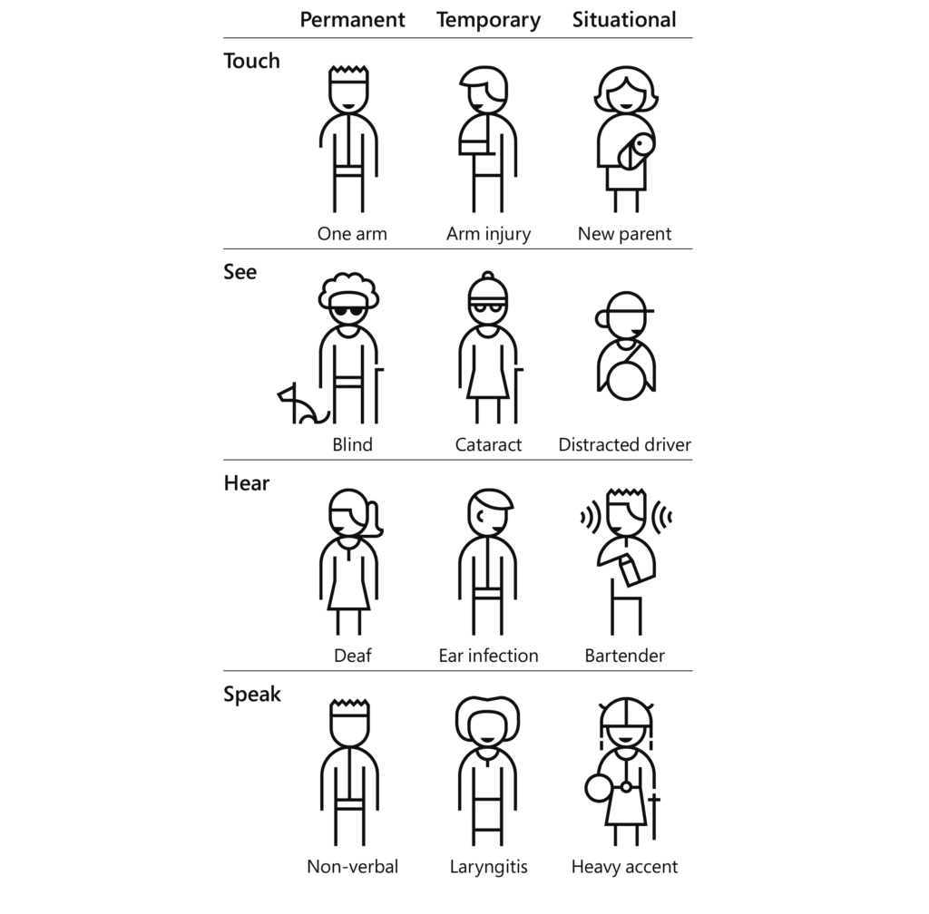
2. Consider temporary and situational disabilities
Web accessibility benefits people with and without disabilities
When we think about accessibility, it’s easy to only consider permanent disabilities, such as blindness, deafness, or a loss/lack of limbs. However, by making efforts to ensure your website is accessible, everyone can benefit even if they don’t have a permanent disability.
Having the ability to interact and consume a website via multiple forms of input, such as on a touch device, using only a keyboard, or voice recognition software, can be of benefit to users who are temporarily disabled or with situational reasons too.
A common example of this is being able to navigate around a website whilst holding a phone to your ear. In this scenario, only one hand is available. If a website has ensured that the site can be operated with only the keyboard, this makes the experience for the user much better whilst they’re on the phone.
3. Check colour contrasts
Colour contrast between text and background can cause issues with legibility. When working on any branded media work for the web, the colour contrast can be easily checked to see whether it meets AA and AAA standards using sites such as color.review. There are several of these around the internet but this is the best one we’ve found so far.

Using it you can identify areas of your website that do not meet the acceptable contrast ratio. Using the colour picker above, it’s easy to select an alternate shade of the colour that does meet the WCAG minimum contrast ratio, but it’s not always that simple. One of the biggest challenges to navigate is when your company brand colours don’t make legibility easy when they’re used in copy, for example. This is also true for branded bus routes, of which there are many in the UK.
Contrast isn’t the only important issue to think about with colour. Colour should not be the only way you are conveying information.
For example, the ‘active’ state on our website timetable control panel is not only represented by colour but is now also identifiable without colour by using a border around the active item.
4. Test with a screenreader
Double-check you have valid HTML
Make sure you check your site has valid HTML markup too. This is a simple thing to ensure is correct and although most browsers are very forgiving about mistakes (such as missing closing tags) screenreaders are not usually as sophisticated and HTML errors can lead to misread pages.
Given that most websites use a content management system of some kind again it’s important to double-check that editable parts of the page don’t make it too easy to introduce these kinds of hidden errors. At Passenger, our Customer Success team provide Passenger Cloud training which covers the responsibility to create and manage accessible content.
Journey planner
Operator websites can be complex ecosystems because of all the dynamic information generated when users request information.
One area that should be a focus for improvement is your journey planner, if you have one. This is one of the most used parts of Passenger-managed websites.
By ensuring the inputs for this feature can be used easily with only keyboard control, and that all the information given can be understood when read by a screen reader, a journey can be planned by almost anybody.
Timetables
PDFs aren’t inherently accessible, so can make it really hard for screenreader users to access the timetable information they contain. This is one of the key reasons why we create dynamic timetables in HTML and then provide PDF versions as an alternative for users that like to see the information in that format.
If you do the same, it’s straightforward to ensure that when a user navigates around the table using a screen reader, the context of the timetable cell selected is understood by the reader and is read out to the user. In our case, the context is the stop name and the line name. Without this, the table can be difficult to use for those reliant on the table being read to them.
5. Ensure website content is created with accessibility in mind
If you’re using a content management system to make regular changes to your website, check that the content you upload is accessible too. If it’s not, it will quickly render the rest of the web page inaccessible too.
Headings
Headings are really important in helping to structure the content of a page. How hard would a book be to read if you didn’t know what the title was, or what the chapter names were?
When editing a page it’s fairly standard to use the content editor to assign different levels of heading, with 2 being the highest/largest. The Heading 1 size is reserved for the title of the page. Headings with an equal or higher rank start a new section and headings with a lower rank start new subsections that are part of the higher-ranked section.
Use headings to structure your content based on the ranking of the heading, not based on the size or visual appeal so that a user using a screen reader may choose to navigate a long page simply by jumping between headers and then reading the content within each section.
Headings are also picked up by search engines such as Google, and screenreaders to help understand the structure of the page. This can have the added bonus of being good for new customers finding you online in search engines – great for attracting new passengers to try the bus.
Images
Images help convey your marketing information or give extra context to a page. Wherever possible you should not put text directly on an image, as this is not readable by screenreader users, Google, or users who have images turned off.
It’s often the case that well-sighted users can’t see the text on an image too. Putting text on an image means the text needs to be of a high enough contrast to be visible. If you put dark blue text on a black background, for example, many users won’t be able to read it.
If you’d like any assistance making your digital services more accessible or would like to talk about our experiences with the ITLS accreditation scheme, then please don’t hesitate to get in touch.

Start your journey with Passenger
If you want to learn more, request a demo or talk to someone who can help you take the next step forwards, just drop us a line.